Brand Identity
St. Albert Avalanche U12 Ringette Team
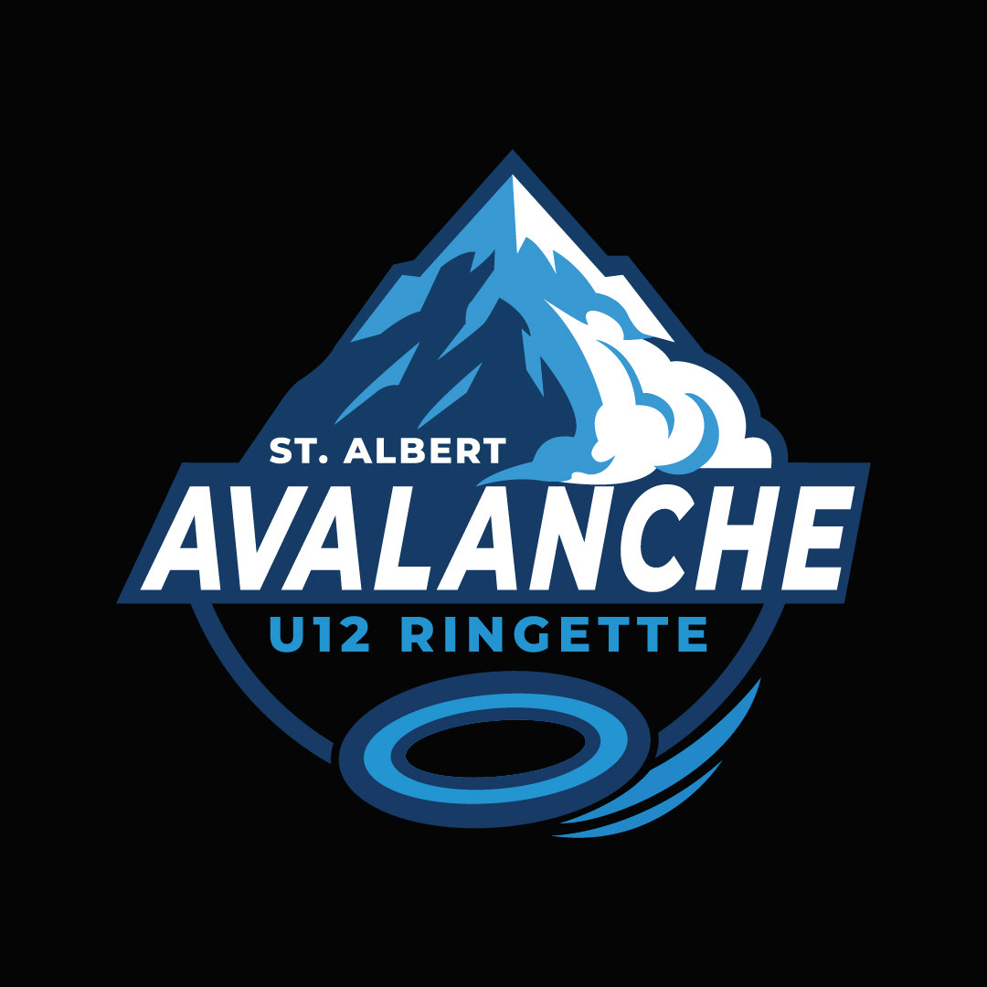
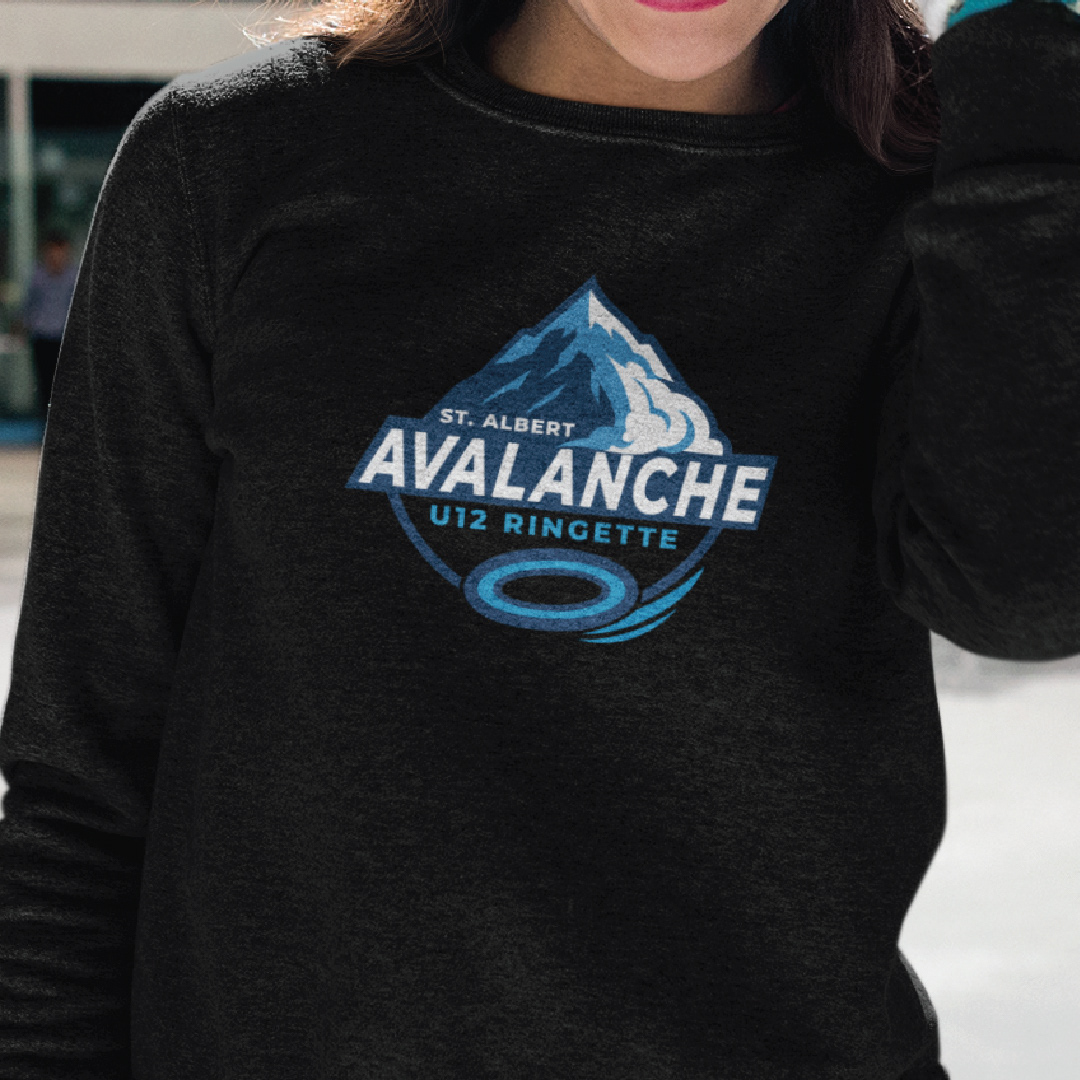
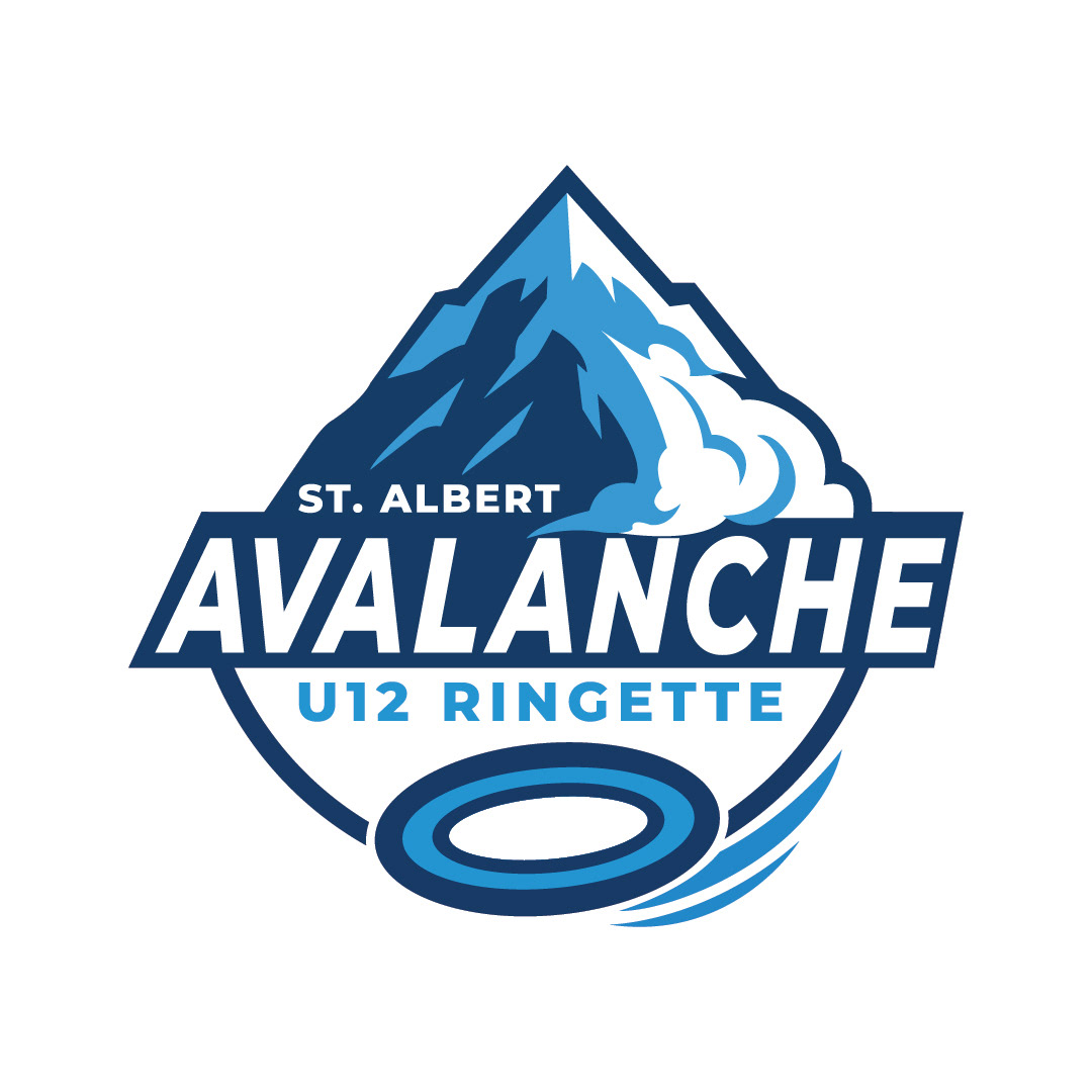
A refreshed logo for the St. Albert Avalanche U12 Ringette Team. Taking the team’s initial concept, I refined and enhanced the design by adding movement to the ring, selecting and adjusting fonts for hierarchy, fine-tuning colors for black apparel, and incorporating “St. Albert.” The result is sharp, bold, and ready to make an impact.
A refreshed logo for the St. Albert Avalanche U12 Ringette Team. Taking the team’s initial concept, I refined and enhanced the design by adding movement to the ring, selecting and adjusting fonts for hierarchy, fine-tuning colors for black apparel, and incorporating “St. Albert.” The result is sharp, bold, and ready to make an impact.
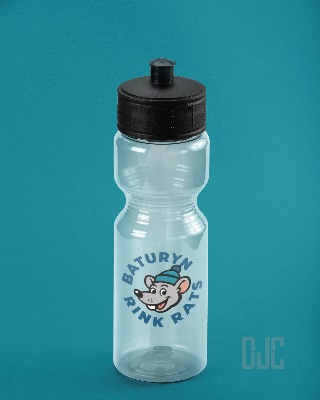
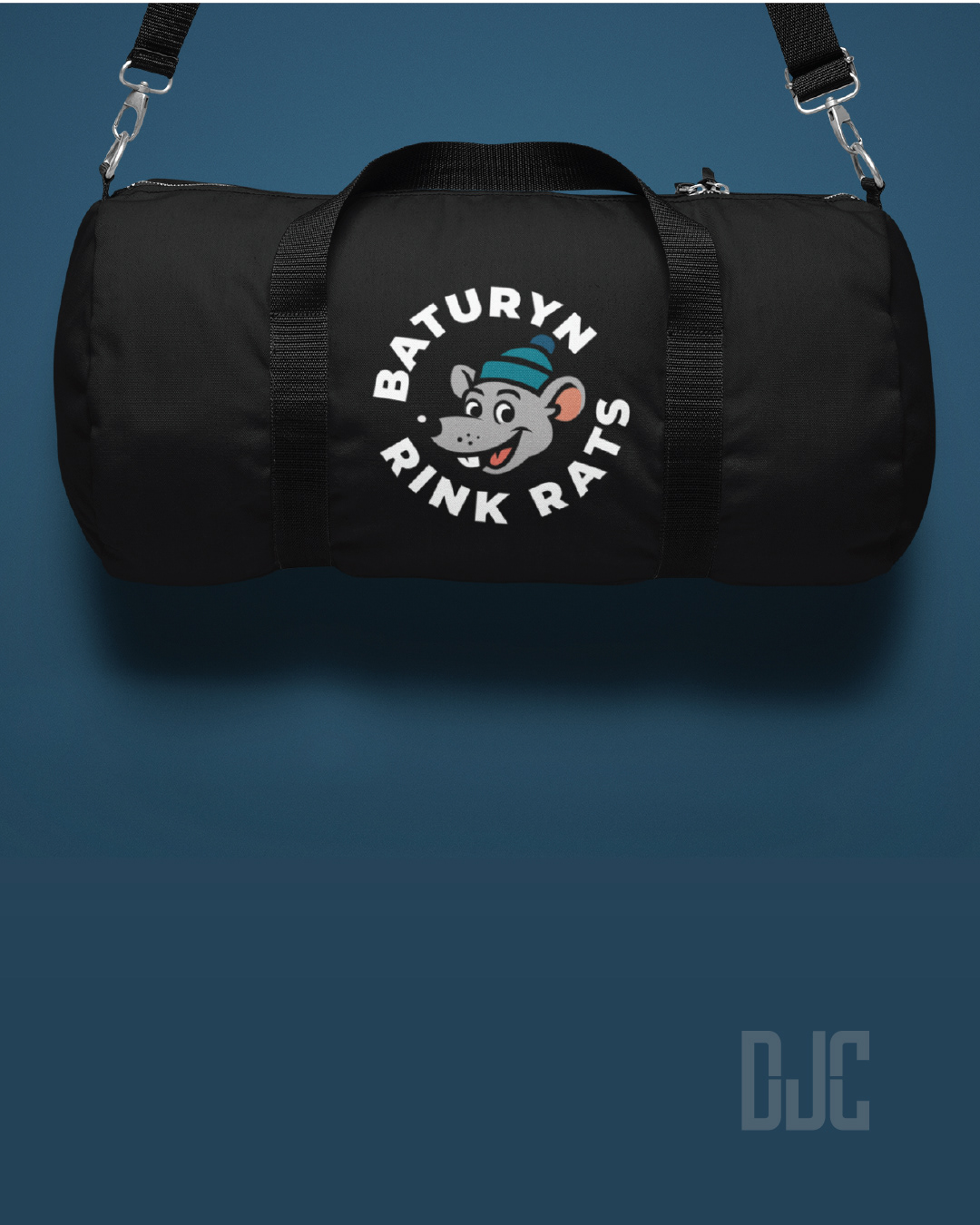
Baturyn Community League - Rink Rats Volunteer Ice Crew
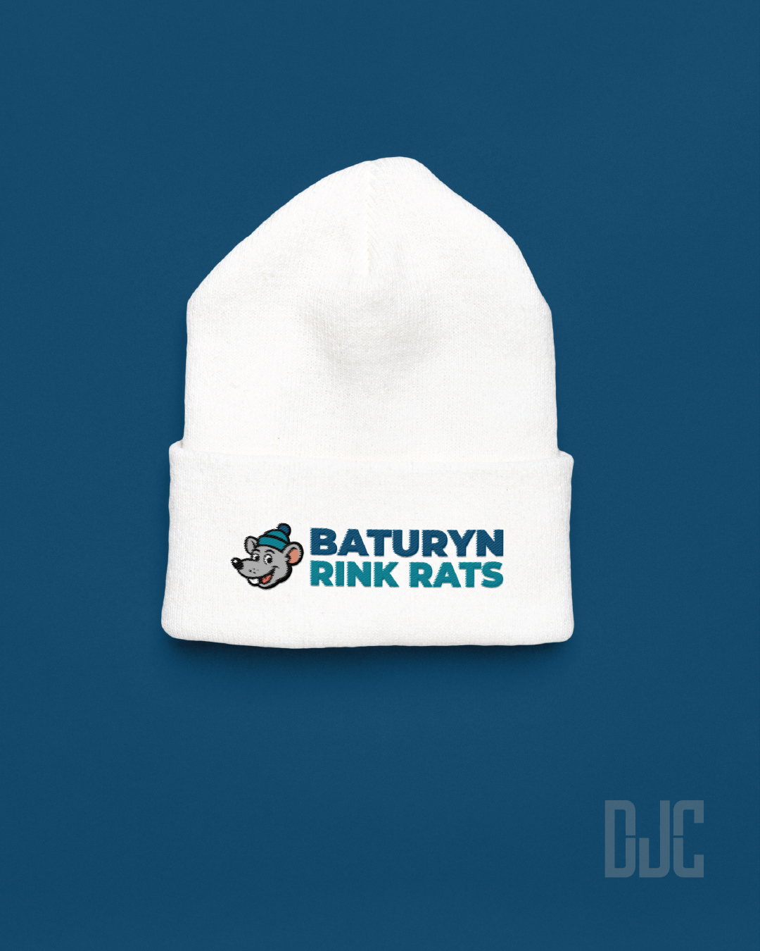
A logo that helps make volunteering to maintain your local rink feel less like a chore and more like being part of a cool club. Used on on socials, and maybe even on some swag in the near future!
A logo that helps make volunteering to maintain your local rink feel less like a chore and more like being part of a cool club. Used on on socials, and maybe even on some swag in the near future!

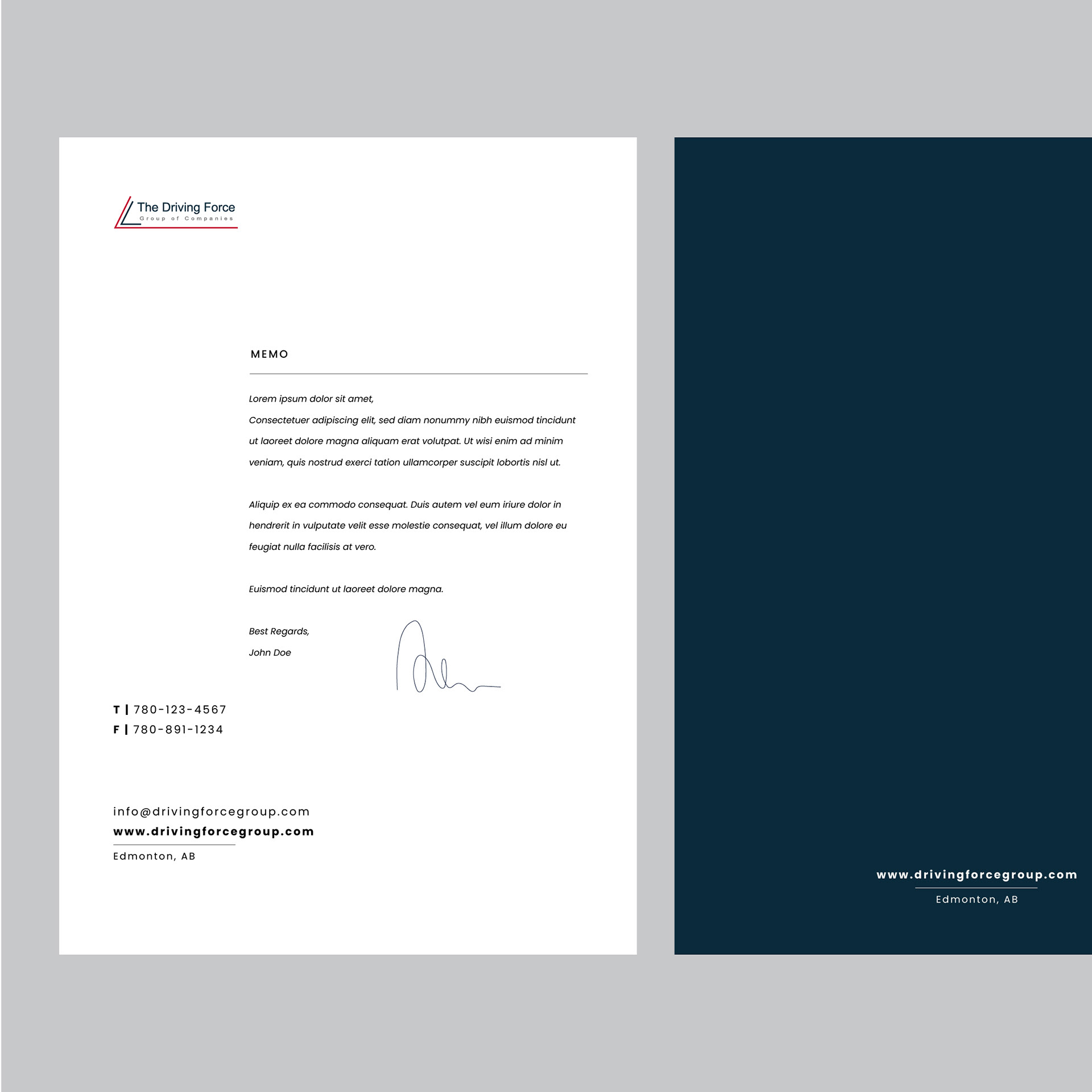
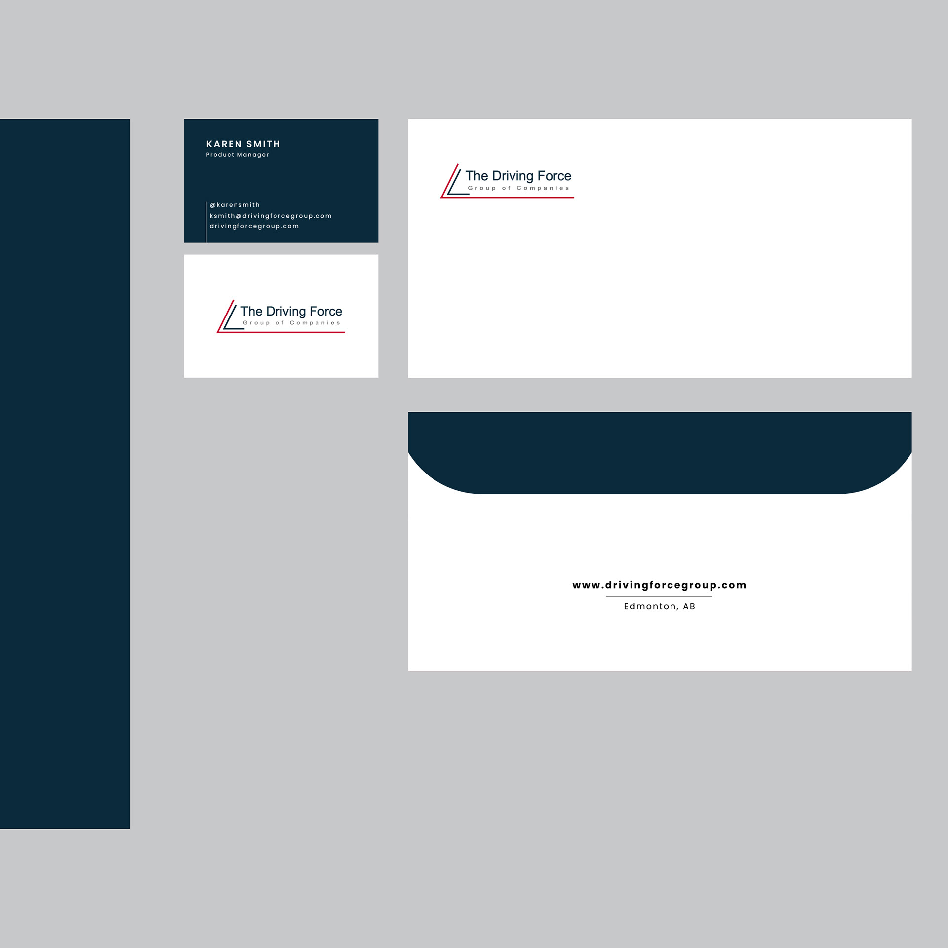
The Driving Force Group of Companies
The Driving Force Group of Companies marked a big step for the company. It all started back in 1976 as Driving Force Vehicle Rentals Sales and Leasing in Spruce Grove, Alberta. This new brand was created for internal use only, so it wasn't meant to be widely seen outside the company. It would be the umbrella company overseeing a group of companies within it. The goal was to maintain a connection to the original brand, so I retained the same slanted angle and colors, but gave it a more polished and modern look since it represents the corporate office. The logo would be placed on items such as letterheads, business cards, envelopes, and workplace signage. It's a symbol of the company's unity and professionalism, reminding everyone of their commitment to excellence.
The Driving Force Group of Companies marked a big step for the company. It all started back in 1976 as Driving Force Vehicle Rentals Sales and Leasing in Spruce Grove, Alberta. This new brand was created for internal use only, so it wasn't meant to be widely seen outside the company. It would be the umbrella company overseeing a group of companies within it. The goal was to maintain a connection to the original brand, so I retained the same slanted angle and colors, but gave it a more polished and modern look since it represents the corporate office. The logo would be placed on items such as letterheads, business cards, envelopes, and workplace signage. It's a symbol of the company's unity and professionalism, reminding everyone of their commitment to excellence.


Yummy Mommy Empire - Jenna Zayac, Wellness Coach
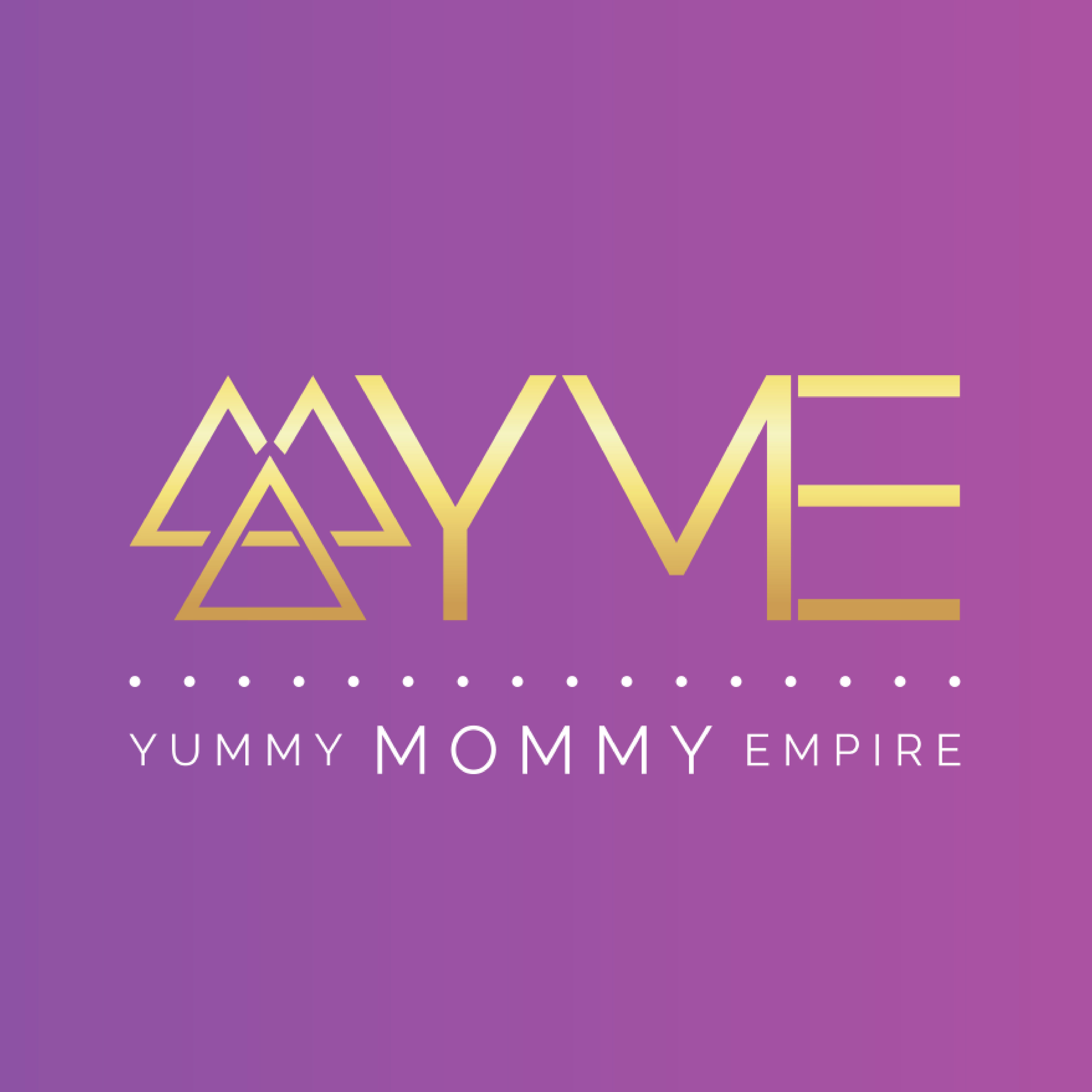
Yummy Mommy Empire: The re-designed logo showcases a serene sunrise effect and a refreshed color palette. Purple symbolizes coolness, spirituality, and tranquility; yellow represents positivity, enthusiasm, and joy; while pink conveys freshness, femininity, playfulness, and youthfulness. The company's fundamental values of social connection, wellness, mindfulness, and gratitude are evident in every detail. Different merchandise options were showcased to demonstrate the seamless integration of the logo. Additionally, a custom mailer box was designed for event and workshop subscribers, enhancing their experience and inviting everyone to engage with the brand's endeavors.
Yummy Mommy Empire: The re-designed logo showcases a serene sunrise effect and a refreshed color palette. Purple symbolizes coolness, spirituality, and tranquility; yellow represents positivity, enthusiasm, and joy; while pink conveys freshness, femininity, playfulness, and youthfulness. The company's fundamental values of social connection, wellness, mindfulness, and gratitude are evident in every detail. Different merchandise options were showcased to demonstrate the seamless integration of the logo. Additionally, a custom mailer box was designed for event and workshop subscribers, enhancing their experience and inviting everyone to engage with the brand's endeavors.
Sherwood Bowl - 5-Pin Bowling Alley
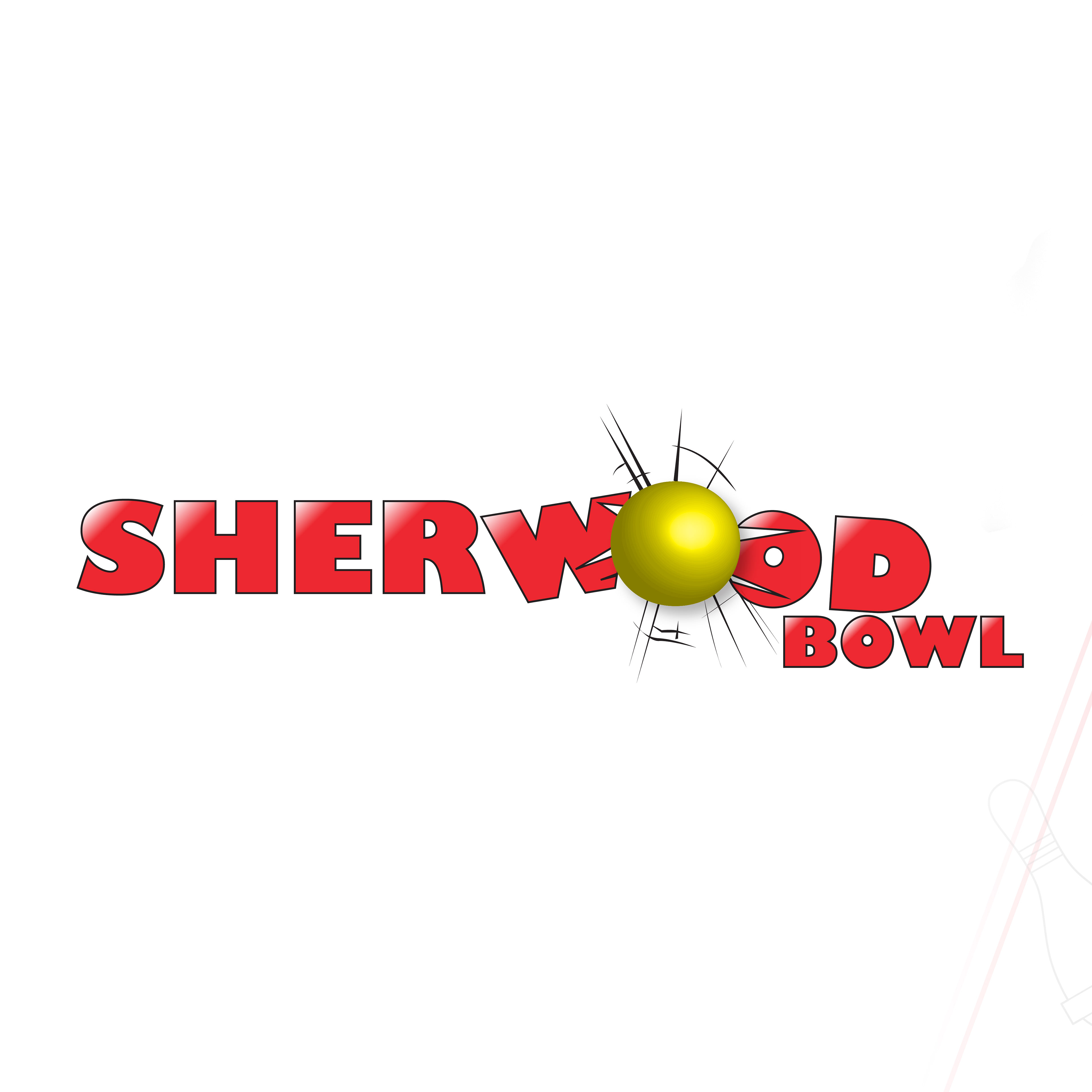
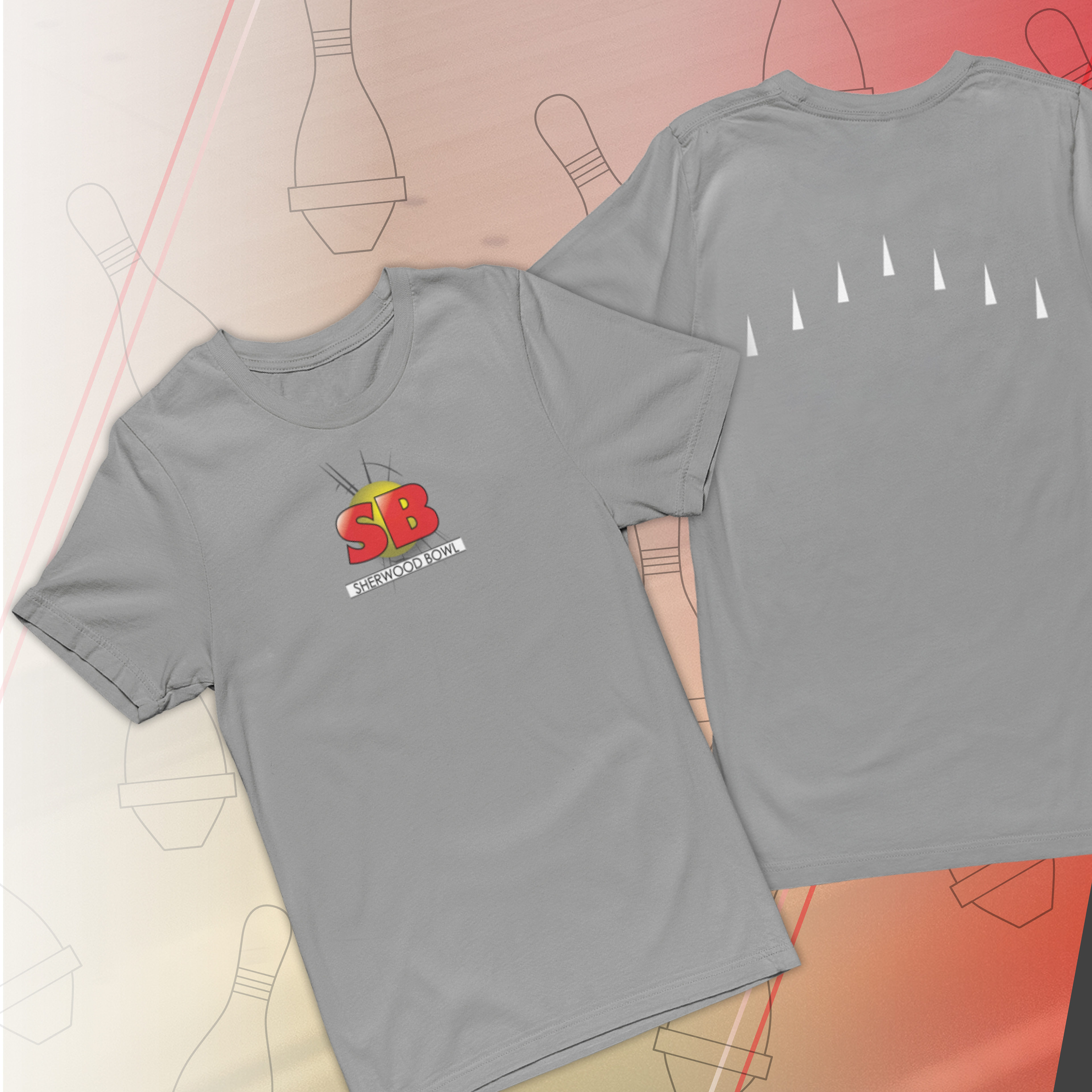
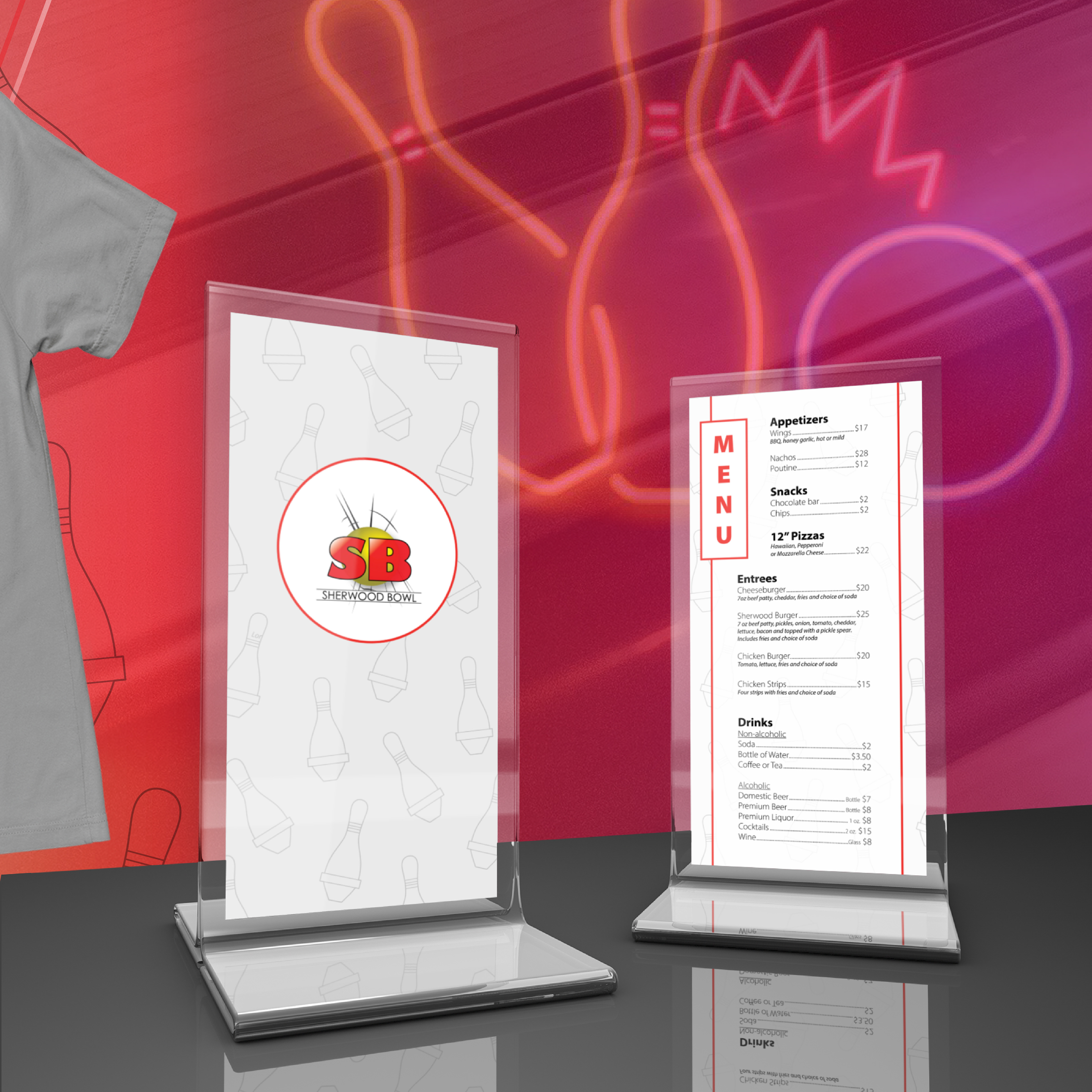
The local bowling alley embarked on a logo and brand refresh to enhance its presence. Alongside public bowling, the alley is home to a talented roster of competitive bowlers, including National Champions and top scorers. The bowling ball symbolizes strength and power, with red representing passion, power, and courage, while yellow signifies joy and happiness, reflecting the sport's ability to bring people together. A shirt design features lane arrows on the back, embodying the essence of the bowling alley. Additionally, a menu design concept showcases the abundance of seating available off the lanes for guests to relax and enjoy.
The local bowling alley embarked on a logo and brand refresh to enhance its presence. Alongside public bowling, the alley is home to a talented roster of competitive bowlers, including National Champions and top scorers. The bowling ball symbolizes strength and power, with red representing passion, power, and courage, while yellow signifies joy and happiness, reflecting the sport's ability to bring people together. A shirt design features lane arrows on the back, embodying the essence of the bowling alley. Additionally, a menu design concept showcases the abundance of seating available off the lanes for guests to relax and enjoy.
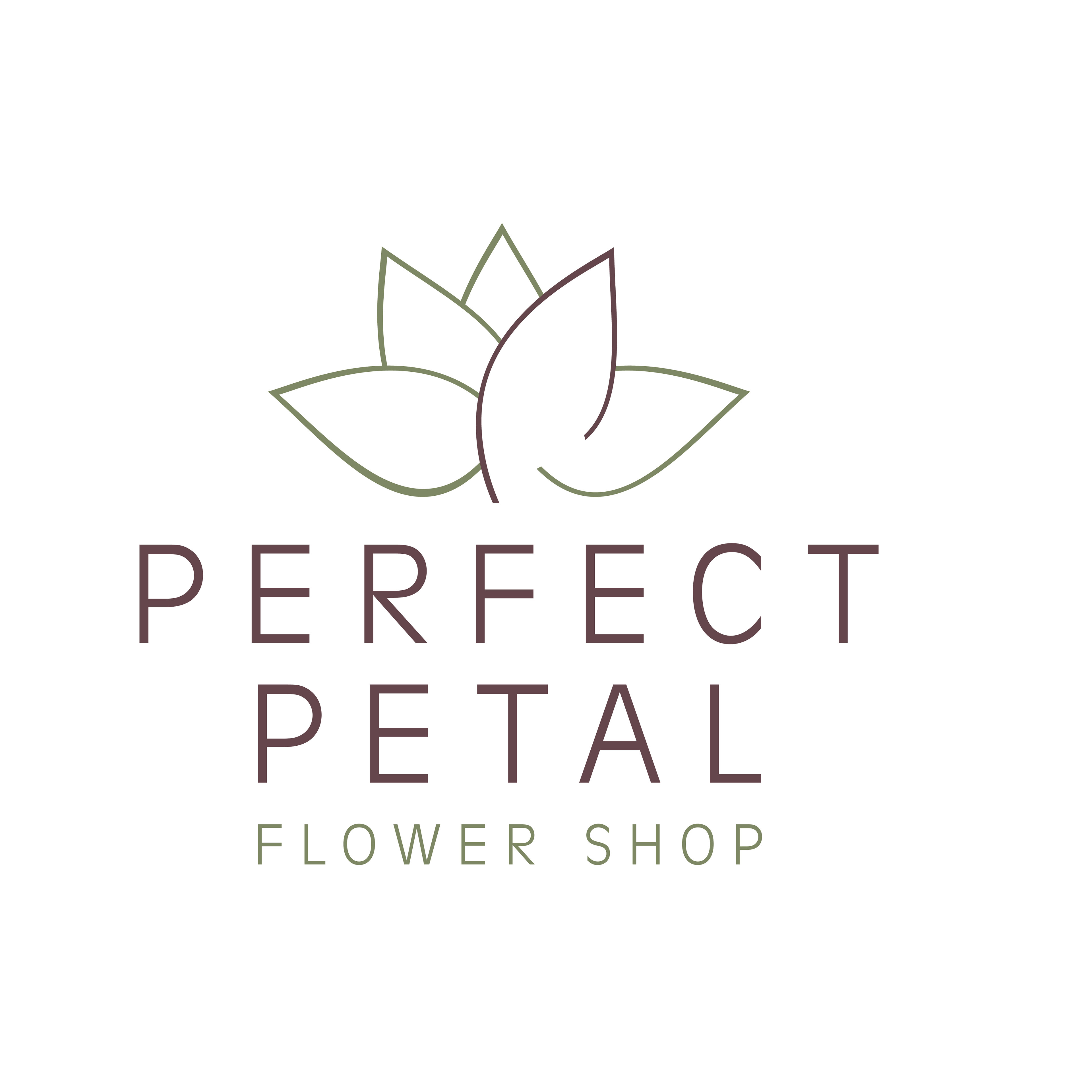
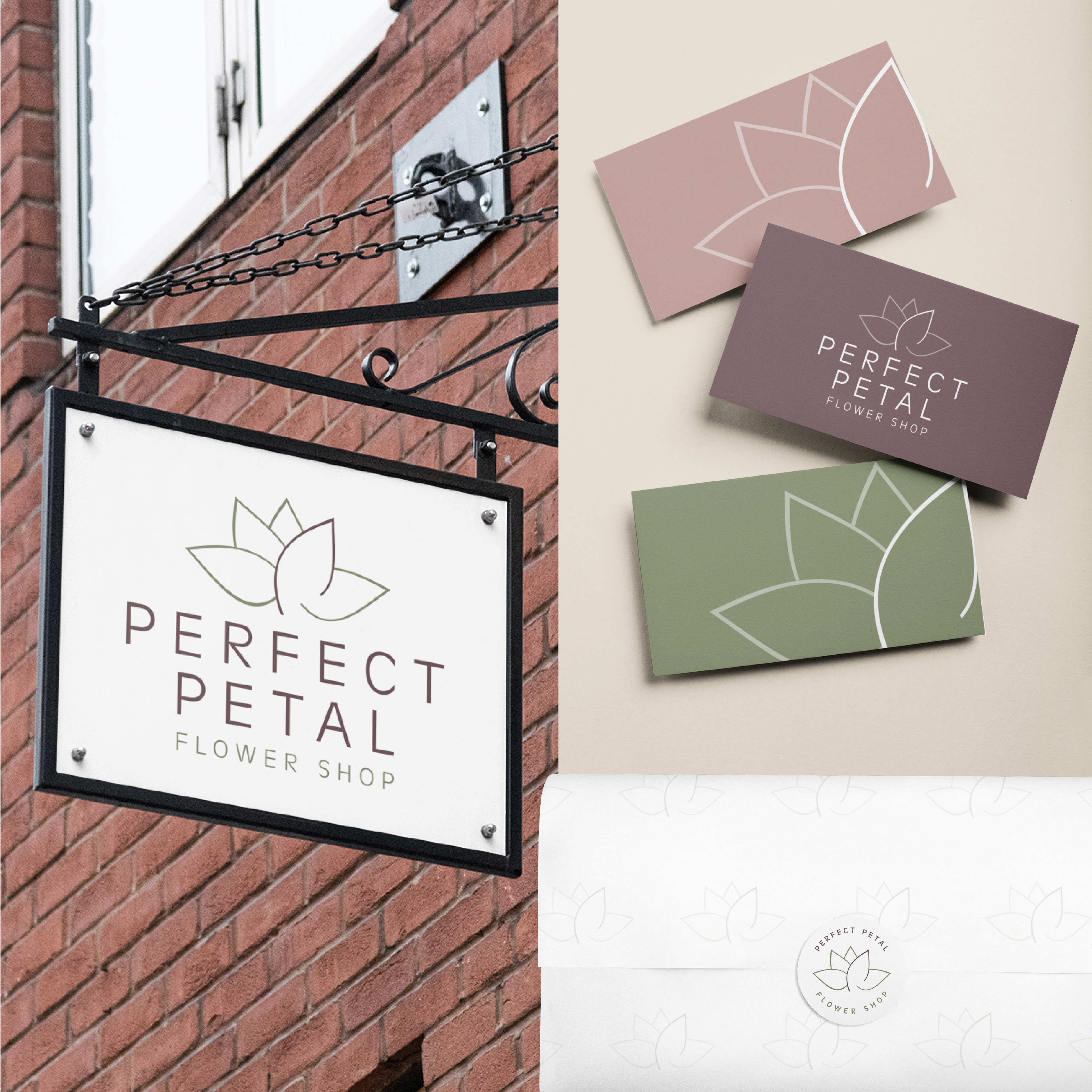

Perfect Petal - Flower Shop
A cherished family-owned flower shop in a quaint small town, recently underwent a brand revitalization to embrace simplicity and a deep connection to nature. Drawing inspiration from natural colors, the brand palette exudes tranquility and harmony, complementing the clean and minimalist logo design that embodies the shop's core mission of spreading joy through flowers. Signage, business cards, and floral wrapping mockups reflect the brand's commitment to quality and nature, with delicate floral patterns enhancing the overall aesthetic. Perfect Petal's brand identity radiates warmth, authenticity, and natural beauty, inviting customers to delight in life's simple pleasures through exquisite floral arrangements.
A cherished family-owned flower shop in a quaint small town, recently underwent a brand revitalization to embrace simplicity and a deep connection to nature. Drawing inspiration from natural colors, the brand palette exudes tranquility and harmony, complementing the clean and minimalist logo design that embodies the shop's core mission of spreading joy through flowers. Signage, business cards, and floral wrapping mockups reflect the brand's commitment to quality and nature, with delicate floral patterns enhancing the overall aesthetic. Perfect Petal's brand identity radiates warmth, authenticity, and natural beauty, inviting customers to delight in life's simple pleasures through exquisite floral arrangements.